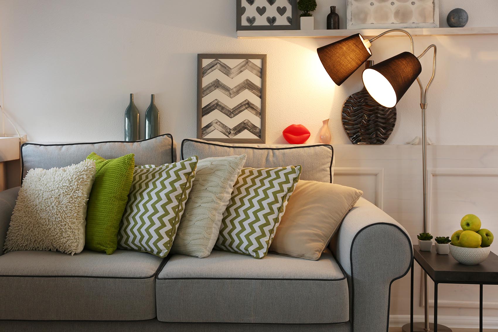
Pantone’s “greenery”—a lively shade of green that will brighten up your day, every day! The Color of the Year is always an exciting option for interior decorators. Every year, color experts from around the world hold an exclusive meeting in Europe to select a color they believe captures themes of the upcoming year. This decision often influences the creative decisions of design professionals all over the world, including those in fashion and interior decorating. And for 2017, greenery is the perfect hue for interior designers. With a fresh pop of color, your clients can feel stylish and be more productive.
Are you looking to freshen up your client’s home with a chic color change? Whether you’re a decorator or a home stager, Pantone’s greenery can be used to modernize any tired home!
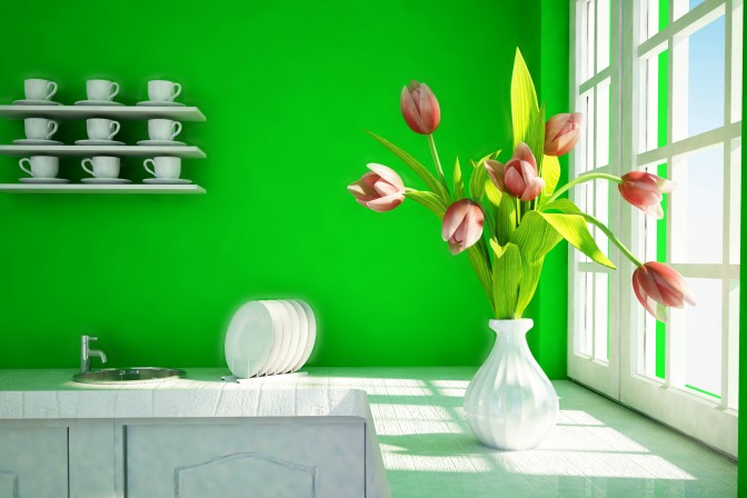 The kitchen is where your clients spend a lot of their time. An important factor in kitchen design is promoting healthy living—so use Pantone’s greenery to enhance motivation and keep your clients health-conscious. Since green is a symbol of nature and growth, reminding your clients to take proper care of themselves is key.
Add greenery to visual areas of the kitchen, including on the fridge and in blank wall spaces. Adding color with kitchen towels, magnets, and artwork is a simple way to make health a key concept in your home designs. A few small pops of greenery-hued accessories will stir thoughts of organic living, encouraging your clients to stay healthy!
 Brighten your clients’ mornings with this mood-boosting color. Add greenery in the bathroom to create a tranquil space where your clients can get ready each day. Invest in cozy, greenery-colored bath towels for a simple addition. Or, find a green plant potter and add a small house plant to the bathroom. You’ll be adding freshness to the bathroom, as well as making the color scheme modern.
If your clients are willing to remodel a bit, consider adding a backsplash to their bathroom sink. Using small greenery-inspired tiles will create a focal point around the sink. It will also work to soften hard ceramic fixtures with chic and decorative patterns. Plus, you can match the greenery backsplash with a cute paint design where the walls meet the ceiling. This will draw the eyes up, making your client’s bathroom feel bigger and brighter.
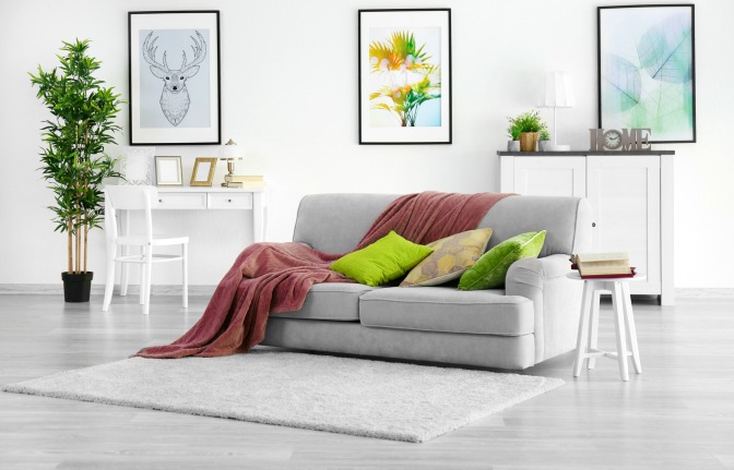 And although green and red complement each other well on the color wheel, this combination can be overwhelming in home designs (Christmas, anyone?). Neutral living rooms are your best bet for bringing out the beauty of Pantone’s greenery. Create focal points in the room with colored curtains, decorative pillows, or colored vases. Your clients will love how this shade makes their home look stylish and relaxed!
If you have ideas or examples of how to use greenery in home designs, share your thoughts in the comments! If you start by focusing on accent and focal colors in your client’s home, you’ll soon become the queen of green(ery).
Bring health into the kitchen
 The kitchen is where your clients spend a lot of their time. An important factor in kitchen design is promoting healthy living—so use Pantone’s greenery to enhance motivation and keep your clients health-conscious. Since green is a symbol of nature and growth, reminding your clients to take proper care of themselves is key.
Add greenery to visual areas of the kitchen, including on the fridge and in blank wall spaces. Adding color with kitchen towels, magnets, and artwork is a simple way to make health a key concept in your home designs. A few small pops of greenery-hued accessories will stir thoughts of organic living, encouraging your clients to stay healthy!
Create curb appeal
Adding greenery to the outside of your client’s home can be a bit trickier—there’s a fine line between a focal color and an overwhelming theme. However, if you use Pantone’s color to accentuate the best features of the home, your design will scream, “Welcome home!” The first place to feature greenery: the front door. Painting the entire door in greenery’s bright shade can overpower the house, so try using stencils to paint gorgeous accent patterns instead. If your clients are skeptical about painting the front door, add color to their window shutters instead. From mailbox to the garage door, adding greenery in small spaces will make your client’s home stand out. Find inspiration by cruising a stylish neighborhood—take note of which designs you like and which ones overpower a home’s curb appeal. Curb appeal is one of the most important aspects of home design, so getting it right can take a lot of deep thought!Brighten the bathroom
 Brighten your clients’ mornings with this mood-boosting color. Add greenery in the bathroom to create a tranquil space where your clients can get ready each day. Invest in cozy, greenery-colored bath towels for a simple addition. Or, find a green plant potter and add a small house plant to the bathroom. You’ll be adding freshness to the bathroom, as well as making the color scheme modern.
If your clients are willing to remodel a bit, consider adding a backsplash to their bathroom sink. Using small greenery-inspired tiles will create a focal point around the sink. It will also work to soften hard ceramic fixtures with chic and decorative patterns. Plus, you can match the greenery backsplash with a cute paint design where the walls meet the ceiling. This will draw the eyes up, making your client’s bathroom feel bigger and brighter.
Liven up the living room
Family and friends spend a lot of time in our living rooms, so it’s important to add lively focal points. In your designs, use greenery to draw attention and make your client’s favorite features stand out! Living rooms tend to focus on warm tones, which add comfort and security to the home. Using greenery will also add calmness to the atmosphere. You’ll need to make sure your colors cooperate with one another, so consider using greenery to complement a warm beige or chestnut-colored living room. And although green and red complement each other well on the color wheel, this combination can be overwhelming in home designs (Christmas, anyone?). Neutral living rooms are your best bet for bringing out the beauty of Pantone’s greenery. Create focal points in the room with colored curtains, decorative pillows, or colored vases. Your clients will love how this shade makes their home look stylish and relaxed!
If you have ideas or examples of how to use greenery in home designs, share your thoughts in the comments! If you start by focusing on accent and focal colors in your client’s home, you’ll soon become the queen of green(ery).
