Not all decor trends are created equal. You may cringe at the design industry for its constantly rotating wheel of colors, but get ready to celebrate this year! Energetic and deep tones are sure to contrast beautifully with the pastel hues we have grown accustomed to lately. As we step into 2018, let’s take a look at the color palettes that will be making an appearance once again this year…
The Color of the Year

Pantone has unveiled Ultraviolet Purple as 2018’s color of the year. This royal tone is sure to materialize in your trendy neighbor’s home soon. Known as the elitist of colors, this blue-based purple is sure to be welcomed by the design community. But how are you supposed to incorporate Ultra Violet into your interior decor without completely overwhelming your space?
Pantone seems to have the answers! They released a series of muted options that incorporate last year’s subtle color schemes with the ever so energetic violet.
Jewel Tones
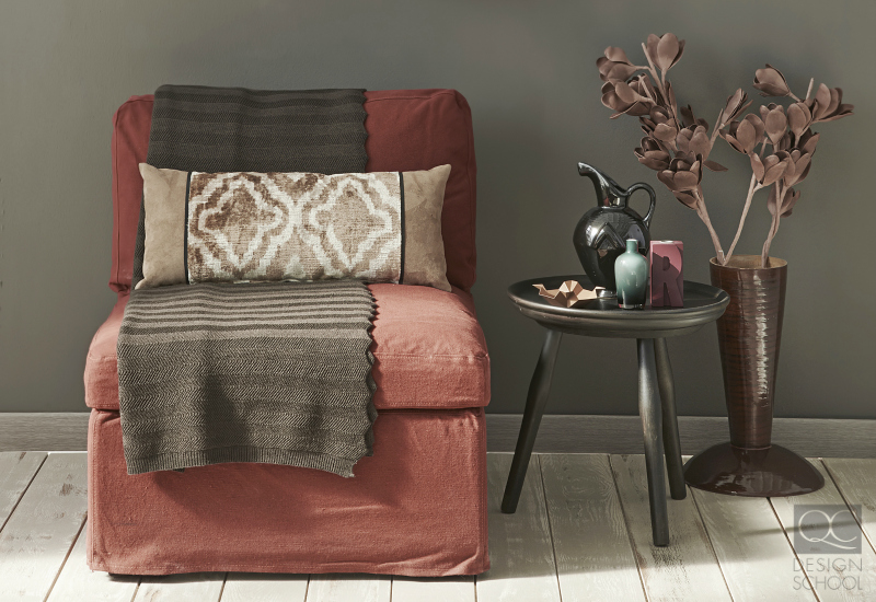
What goes better with jewel tones than more jewel tones? There is something luxurious about layering rich colors on top of one another. There cannot be a more luxe combination than those involving paired jewel tones!
This year, think peacock feathers and colorful galaxies for inspiration. The richness of jewel-toned palettes has been popular before, particularly amongst royalty. With an unrivaled ability to draw the eye, palettes made of blues, purples and turquoises are sure to be a favorite for home decorators in 2018. Diving deep into these royal hues can feel overwhelming, but don’t worry – there are more options for you!

Pastel Fever
Who says Ultraviolet can’t also be ultra light? Not us!
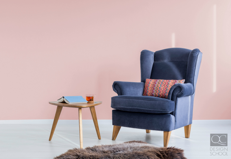
Color schemes should not be taken lightly, but in this case, maybe they can be. You can capture 2018’s biggest trend without completely having to step out of your comfort zone – cue the pastel parade. Soft colors can add warmth to your home, and what could be more suited for the one place you are allowed to stay cozy in all day? In some form, pastels make a comeback every spring.
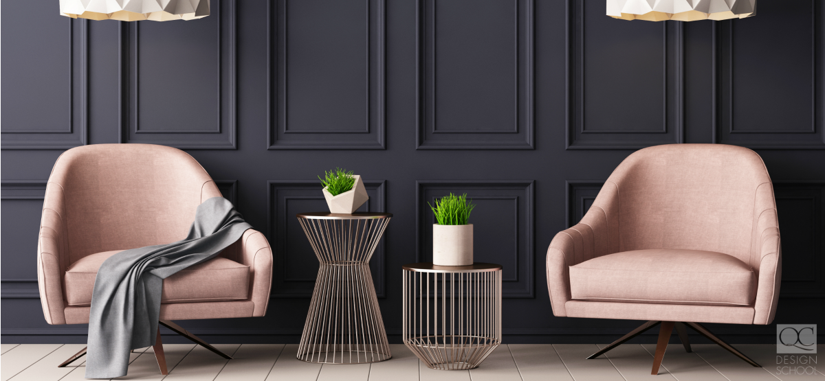
This year’s palette, however, may not be your typical periwinkle blue. Dusky roses and greys will act as the perfect stage for Ultraviolet to pack its punch. Benjamin Moore certainly seems to think so! The interior paint company forecasts a palette filled with soft shades and ethereal versions of reds, blues and pinks. This year’s pastel palettes are definitely for you if you aren’t quite ready to take a walk on Pantone’s Ultraviolet wild side.

Denim Accents
It’s no secret that the design world extends beyond the world of home decorating. Designers among all industries share inspiration and trends. It won’t come as a surprise if denim shades of blues made an appearance as a leading set of colors this year.
Spring and summer 2018 runway trends have featured copious amounts of denim, primarily in deep washes. But denim as decor? It could be a stretch. But rich shades of indigo blue may not be! Especially since it pairs oh so beautifully with Pantone’s Ultraviolet. Try adding some deep shades of denim blue to your color scheme. You may be surprised at how neutral colors like navy appear in your home. The color is a classic favorite for many, adorning homes and closets alike. Denim-inspired accents are sure to make a comeback this year.
Incorporating these color comebacks into your home doesn’t need to feel so bold. You probably have many of these subtle shades in your home already! Keep your base simple, and incorporate this year’s palettes without over-committing. After all, we are only a short year away from a completely new set of interior decor color trends!
Accessories are the perfect way to experiment with colors you may not feel comfortable with yet. Try adding a deep jewel-toned lamp shade to your bedroom or living room and see how you feel. Mirroring interior design trends can be done cost-effectively, and in a less bold way than painting an entire accent wall.

