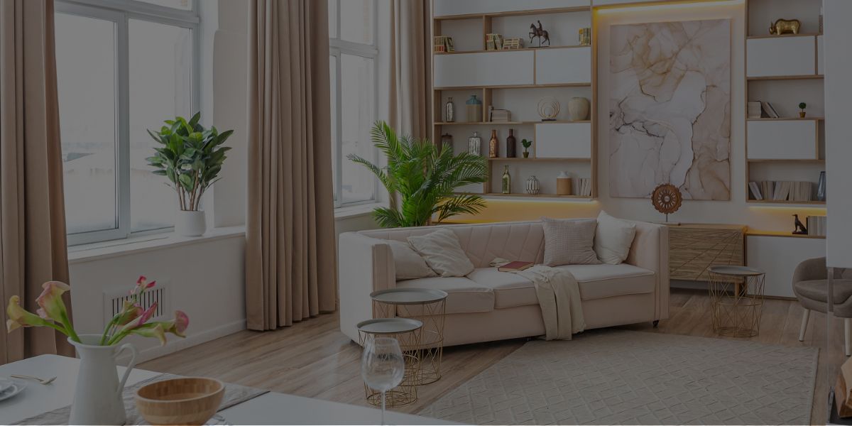
These colors are hot right now, and are predicted to remain popular through the end of the year. In this blog post, we’ll discuss why each of these colors is so popular and how YOU can use them in your own home.
Looking to give your home a fresh update for 2022? Then you’ll want to keep an eye on the latest interior design color trends!
So, let’s get started!
What colors will be trending in 2022 in the world of home design? We’ve put together a list of 11 that are sure to freshen up your (or your client’s) home this year!
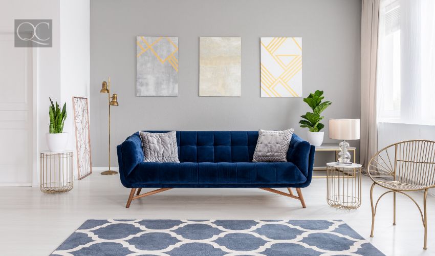
1. Moody Blues
This deep blue is perfect for creating a cozy and relaxing atmosphere. Moody blues can be used in any room of the house – but they work especially well in bedrooms, bathrooms, and living rooms. Examples of “moody blues” include navy, cobalt, and ultramarine.
If you’d like to try this interior design color trend in your home this year, try painting an accent wall, or using it in furniture and accessories. You can also use blue bedding or towels for a quick update.
Pro Tip: To really make this color pop, use it as an accent wall or pair it with light wood tones!
2. Bright Whites
Bright whites are perfect for making a space feel clean, fresh, and modern. This color is also the perfect choice for minimalist or contemporary design styles.
If you’re looking to add some bright white into your home in 2022, try painting your walls or using it in furniture and accessories. You can also use white bedding or towels for a quick update. And if you really want to make your white colors pop, use it as an accent wall or pair it with dark wood tones!
Need some help picking the perfect white paint? This article by Real Simple lists 21 of the most popular bright whites!
3. Grays
When it comes to interior design color trends, grays are nearly always a popular option. They can give a space a modern or contemporary feel. Not to mention, they work well in any room of the house!
If you’re looking to add some gray into your home (or your client’s home) this year, try painting your walls or using it in furniture and decor. You can also use gray bedding or towels to quickly and easily accessorize. Moreover, you can pair them with light wood tones for a truly stunning final result!
Here are some popular gray paint colors that we personally like:
- Gray Owl OC-52
- Gray Cloud 2126-60
- Stormy Monday 2112-50
- Silver Half Dollar 2121-40
- Amherst Gray HC-167
- Steel Wool 2121-20
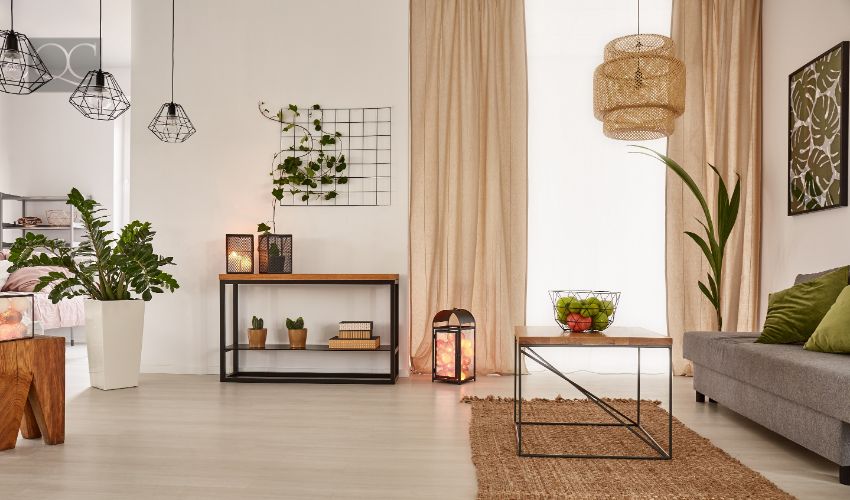
4. Earth Tones
This year, earth tones are making a comeback in the world of interior design! These colors include browns, greens, and oranges. They’re perfect for creating a warm and inviting atmosphere, especially in the fall and winter months.
Examples of earth tones include (but aren’t limited t0):
- Taupe
- Khaki
- Beige
- Olive green
- Burnt orange
Interested in giving this color trend a try? You can paint your walls in earthy tones or incorporate it into your furniture. Another option is to choose bedding and/or towels in earth tones, in order to quickly and easily accessorize.
Plus, if you go one step further and pair them with white or light wood tones, they’ll really stand out and look their best!
5. Metallics
Metallics – such as gold, silver, and bronze – are a timeless, chic way to add some visual interest to any space. They work well in both large and small doses, and can be used in any room of the house. This is just one reason why they’re such a sought-after interior design color trend!
If you want to incorporate metallics into your home in 2022, try using them in furniture or room accessories. Alternately, you can also paint an accent wall with metallic paint!
Pro Tip: When using metallics, less is usually more. Too much of this color can look gaudy or tacky – and we know you don’t want that!
6. Pastels
Pastels are a great way to add some femininity and softness to any room in your or your client’s home. Moreover, they come in a variety of colors, so you’re sure to find one that matches your personal style and preference!
Here are some common examples of popular pastel colors:
- Lavender
- Rose quartz
- Mint green
- Peach
- Baby blue
- Bright gray
- Cream
Regardless of how you choose to incorporate pastels into your living space this year, one thing’s for certain: they’re the perfect way to achieve a calm and relaxing atmosphere in any room!
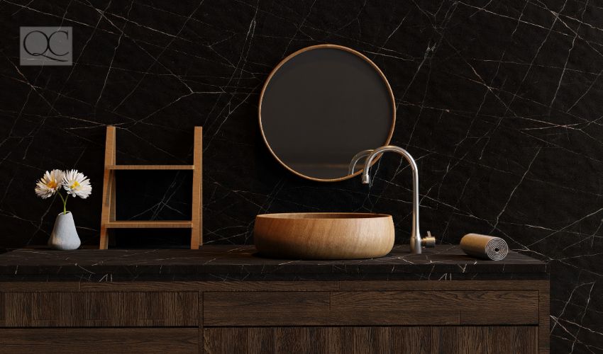
7. Dark Colors
Dark colors – such as black, navy blue, and deep green – are perfect for creating a dramatic and luxurious feel in any space. They’re also great for making small rooms (such as tiny bathrooms) appear larger than they actually are. Just be sure not to go overboard – too much of these colors can make a space feel too small and cramped!
Popular dark paint colors include (but aren’t limited to):
- Benjamin Moore Asphalt CC-548
- Benjamin Moore Southern Vine 2138-10
- Sherwin-Williams Peppercorn SW 7674
- Sherwin-Williams Tricorn SW 6258
Pro Tip: When using dark colors, be sure to balance them out with light woods or bright whites. This’ll help create visual interest and keep the space feeling open and airy.
8. Neutrals
Neutral colors – such as white, cream, and beige – are always popular in the world of interior design. This will be no different in 2022! People tend to like neutrals because they’re excellent at creating a clean, classic look that never goes out of style. Plus, they go with just about everything!
When using neutrals, one sure-fire piece of advice is to mix and match different shades. This’ll help create visual interest and depth, regardless of the room. If you need some help choosing the right neutral color(s), Veranda wrote an awesome article where they list 21 of their top picks!
9. Bold, Dramatic Colors
Next, we have bold colors! These are perfect for people who want to make a statement in their home. Whether you choose to paint your walls or incorporate them into your furniture, bold colors are sure to add some personality and unff to any space!
If you or your client want to step outside of the box in 2022 and go with a bolder color, here are some colors you can pick from:
- Red
- Yellow
- Pink
- Bright green
- Orange
- Deep purple
It’s SUPER important to keep color psychology in mind, though. Certain colors are proven to work better in certain rooms, whereas others can have negative consequences. For example, they say you shouldn’t paint your bedroom walls red. This is because red can evoke negative moods and emotions, and your bedroom is supposed to be a calm sanctuary for both your body and your mind!
10. Monochromatic Colors
When it comes to interior colors for 2022, we can’t forget about the monochromatics! These are variations of the same color, and they work well together because they share the same hue (or base color). Monochromatic colors are popular in interior design because they create a cohesive look, which is especially ideal for those who want their home to feel put-together and polished.
If you’re interested in using monochromatic colors in your home, here are some tips:
- Start with one color that you really like. From there, you can pick different shades (i.e. light, medium, and dark) of that same color to use throughout your space.
- Another way to approach this color trend is by choosing a color scheme. This is where you pick 2-3 colors that complement each other, and use them throughout your space. A popular example of this is the “analogous” color scheme, which uses colors that are next to each other on the color wheel.
- Once you have your colors picked out, it’s time to start thinking about what pieces of furniture and decor you want to use. Try to stick with 1-2 main colors, and use accent pieces to introduce other shades. This’ll help keep the look cohesive and pulled-together.
11. Soft Greens
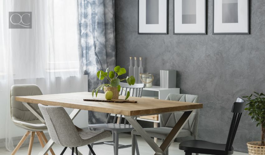
Lastly, we have soft greens. Soft greens are one of the top color trends in interior design for 2022, especially in rooms that get the most natural lighting. This is because they have a calming effect, and they can help create a serene environment. Thus, soft greens are perfect for people who want to feel relaxed in their home!
Not sure which soft green is right for you? This article by The Spruce might give you some inspiration!
These hues are well-complemented by plant-life and artwork (just make sure the type of artwork has the same kind of vibe). Soft greens also go beautifully with light wood, whites, and cream colors.
Want to Become a Color Expert? Get Certified with QC Design School!
The home design industry is highly saturated and extremely competitive. If you want to pursue a professional career, a natural eye for design might not necessarily be enough for you to succeed. The only real way to achieve any sort of success is to first get properly trained and internationally-certified.
That’s where QC Design School comes in!
Our school is globally-recognized and accredited with an A+ ranking by the Better Business Bureau. Our wildly popular programs cover everything from color consulting, to interior decorating, to professional organizing, to home staging, and more.
The best part?
ALL of our courses are self-paced and done right from the comfort of your own home (yes, even the hands-on training – of which there is tons)! Not to mention, you can easily graduate in as little as 3-6 months… With an internationally-recognized certification + designation to add to your resume!
So, our only question for you now is: what are you waiting for?
