Christina Kittelstad is a tutor of QC Design School and an accomplished color consultant, home stager and painter whose work has been featured on HGTV’s show House Hunters. She is the owner and lead color consultant for Spiral Design Color Consulting. She’s best known for creating beautiful, functional spaces through the use of color and creating a sense of style and personality that’s as unique as each of her clients.
It’s a new year for color and that means new color trends and predictions! As a color consultant, this is an exciting time of the year. You’re discovering the colors that’ll be hot and on trend in the coming year, and each forecaster has its own predictions of what will be the hottest colors. Pantone, Sherwin Williams, Benjamin Moore, Behr, and others have all announced their 2019 Color of the Year. So, without further ado, here are my own predictions!
I’ll give you my picks on what colors will be popular and will be making an appearance in interior decorating and home design.
Earth Tones
One of the biggest trends I see for 2019 is a shift to warmer, more neutral color palettes. These palettes are calm and include more earth tones and muted pastels. Sherwin Williams’ Color of the Year, Cavern Clay (SW 7701), is a great example. It’s warm, modern, and hints towards southwest style. Colors found in nature like spicy Cayenne and vibrant Coral will be big in 2019. I have used Cavern Clay for many years, and it’s a color that my clients love. These bolder colors will be seen in smaller areas and as accents more than in entire rooms.
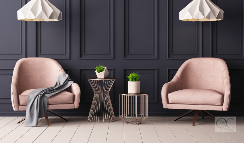
Soft and subtle greens such as Benjamin Moore’s Soft Fern (2144-40) and, one of my very favorites, creamy pinks like Benjamin Moore’s Head Over Heels (AF-250) will also be popular. Schemes will mix warm and cool colors together to create a perfect balance that is relaxing yet modern. We will see more warm grays, taupes, and greige that pair nicely with popular earth tone palettes. I love a rich gray with soft pink!
Rich, moody blues, dark greens and possibly purples like Behr’s Color of the Year, Blueprint (S470-5), and Benjamin Moore’s Hunter Green (2041-10) offer a rich palette that also gives a classic, lived-in look. Look for these colors in dining rooms, accents, ceilings, and in the master suite!
Accents
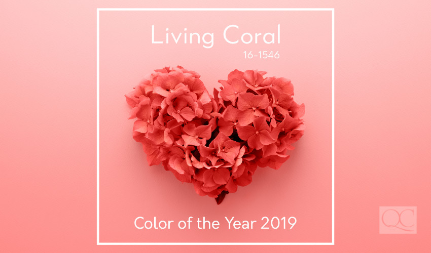
Accent colors will have their moment. I predict we will see more charcoal, hot pink, retro coral, dark teal, and comforting yellow like Pantone’s Marigold and Pantone’s Color of the Year, Living Coral. These colors will be seen in fashion this spring and will, of course, make their way into the design world as well.
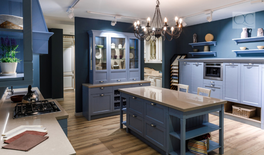
Deep teal greens and rich navy like Benjamin Moore’s Beau Green (2054-20) and the popular Hale Navy (HC-154) will look amazing on built-in bookcases, dining room ceilings, and kitchen islands. They give a natural vibe of comfort and relaxation yet also pair well with ever-popular grays that will continue to be seen in 2019.
Timeless Colors Remain
While color trends are moving towards a warmer, more muted color palette, there are a few colors that will continue to be popular in 2019 and can mix and match perfectly with Colors of the Year.
Black has been hugely popular this past year. True black, charcoal and bronze will continue to appear on palettes. Sherwin Williams’ Tri-corn Black (6258) and Iron Ore (7069) are two of my favorites. I love these colors on doors, accent walls, and exterior color palettes. They offer contrast and depth without overwhelming a space.
White in all its forms will continue to be seen, especially modern, bright whites like Benjamin Moore’s Decorator White (OC-149) and Sherwin Williams’ Extra White (7006). I love how crisp whites pair with other trending colors like charcoal, emerald green and navy. It creates a fresh, clean look that’s a winner every time!
Light Gray is the perfect neutral. It has the ability to be a beautiful backdrop for almost any color. That makes it the go-to neutral for 2019. Sherwin Williams’ Repose Gray (7015) and Benjamin Moore’s Balboa Mist (OC-27) paired with trending pops of color like earthy clay, vibrant coral, or my favorite – dark teal, will make a perfect palette.
Blues
Blues aren’t going anywhere anytime soon. They are relaxed, timeless and America’s favorite color. With such a wide range of options, from true blue to slate to navy, there’s a perfect hue for everyone. Expect to see even more blue in 2019, whether it’s in an entire room or on accent areas such as kitchen islands and cabinetry.
Bring It On
As I head into the next year of design and color, I am excited to incorporate new and exciting colors into my palettes. I also look forward to continuing to pull in tried and true colors that I know my clients will love.
It’s fun to experiment with color, and our clients look to us for confidence in trying something new, while also having the wisdom to know what will actually work for their individual decorating style and space. It’s a balancing act for sure, but when done well, it creates timeless spaces that will be loved for years to come.
Happy New Year!
What colors are you excited to see in the interior decorating and design world this year? Let us know in a comment!